
On 1 October 1960, the landmass internationally known as Nigeria was granted independence by its erstwhile “colonial masters”, setting the stage for a journey that has now spanned sixty years. There are already a tonne of viewpoints and articles evaluating the sexagenarian with in-depth analysis, but I have chosen a different route. Instead of making a judgement call, I would present data and let you decide how Nigeria fared over six decades. After all, they say “a [graph] is worth a thousand words”.
First, I digress. I began this blog on 1 October 2014, so it’s been six years of writing continuously, sporadically, and sometimes infrequently. Across about 270 articles, I think I have maintained my course, writing about anything that caught my fancy — “The World As I See It”. Here’s a toast to whatever the future may hold for this blog.
Back to Nigeria at 60. As you proceed, you would see some graphs categorised under economy, health, education, and infrastructure. Within these categories, I have selected some indices to empirically assess Nigeria’s performance from 1960 to 2020. For indices such as Gross Domestic Product (GDP) that are inherently continuous (on an annual basis), data is shown for four milestone years, while for indices such as literacy level that is discrete because countries do not report on a yearly basis, I have taken the latest available data, which may or may not be for 2020. The data was extracted from the World Bank’s data portal that aggregates indicators from diverse sources.
Nigeria’s performance was compared with four sets of countries comprising:
- African Peers – Egypt, Ghana, Rwanda, South Africa
- Asian Tigers – Singapore, South Korea
- Similar Population – Brazil
- Other Boomers – China, Malaysia
One last thing before you proceed. In my former life as a management consultant, my boss would have been highly disappointed that I would throw out data without any “so what?” analysis. I have deliberately chosen to sin today because if I had to discuss each graph, maybe this would become a thesis. May you read the thousand words that I have not written!

Economy
Gross Domestic Product (GDP)

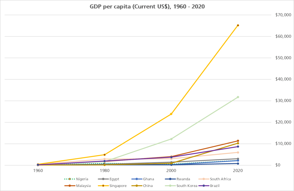
GDP Per Capita
Health
Life Expectancy

Maternal Mortality Rate

Infant Mortality Rate

Education
Adult Literacy Rate

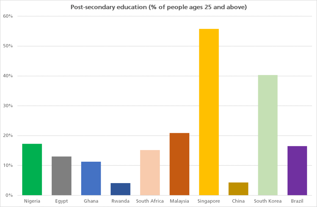
Educational Attainment
Infrastructure
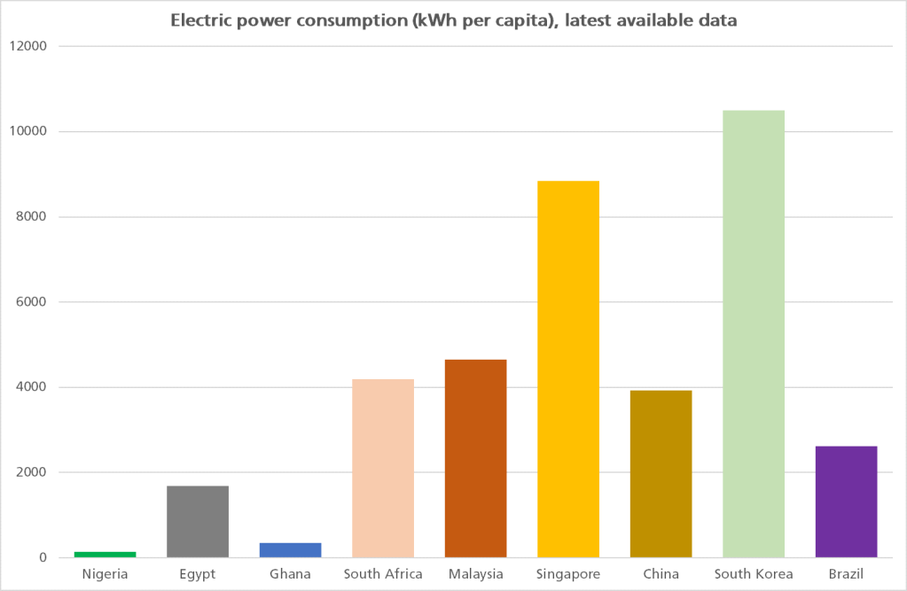
Electric Power Consumption
Electricity Access

Final Thoughts
They say data does not lie but you can lie with data. You have looked at a snapshot of Nigeria over sixty years. Have we done well? Or, do we deserve knocks just above our cerebrum? While you’re at it, there’s a thoughtful article from Tim Nwaobilo that I think you should read.
Image Credit (Nigeria at 60 logo): Government of Nigeria

Words for Thought!
LikeLike